4 March 2021
Brand Redesigns from 2020: A Recap
It makes sense that many of us wanted a fresh start after the year that was 2020. That’s why so many brands took the time to refresh their logo and brand identity (because what else was there to do?!)
Here’s a look at some of the major brand redesigns from 2020.
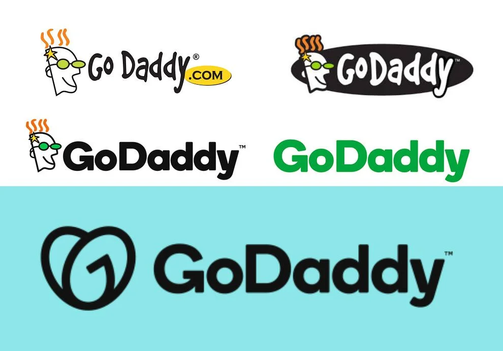
GoDaddy
GoDaddy is not afraid of a rebrand.
They go through brand redesigns relatively often in order to continue to stay fresh and relevant — which is important for an extremely online brand.
Their latest rebrand has simplified their logo once again and combined the G and O in “Go” to be shaped like a heart for their brandmark. This humanises their brand, adds clever impact and delivers what the market is asking for.
Hot Tip: There are no rules around how often you can update your logo. If it feels right, go for it! The worst thing you can do is leave it too long and become outdated.
![]()
![]()
Toyota
Like many other car brands in recent times, Toyota has opted to simplify their brandmark.
They’ve abandoned the watermark and opted for a flat 2D logo. Simple, clean, effective.
This also demonstrates how the brand is so globally recognised that they no longer need to state their brand name. The logo is enough on its own.
Hot Tip: It’s always best to have two versions of your logo, one with your brand name and one without. This increases brand recognition.
![]()
![]()
TripAdvisor
The notorious TripAdvisor owl had a redesign in 2020.
The travel site has just celebrated its 20th anniversary and they wanted their refreshed brand identity to last the next 20 years.
The previous logo had a lot more detail and included various colours. By changing the logo to be one colour and work well at any size, the brand design is more flexible, simple and showcases a bolder personality.
Hot Tip: Always consider where your logo will live in the real and online world. It has to be effective not just on a white background, but in all settings.
![]()
Cadbury
We bet that Cadbury featured in many households throughout 2020. There’s no better comfort food than choccy.
Just like the limited edition Caramilk was an epic throwback, so too is their brand redesign. The new Cadbury wordmark nods to their history as it takes inspiration from the hand of the founder of Cadbury, John Cadbury.
The change was brought with digital execution and enhanced romanticism. It links the brand to its beginnings and emphasises its authenticity.
Hot Tip: Sometimes looking back is the best way to innovate. Take your original branding and give it new life.
![]()
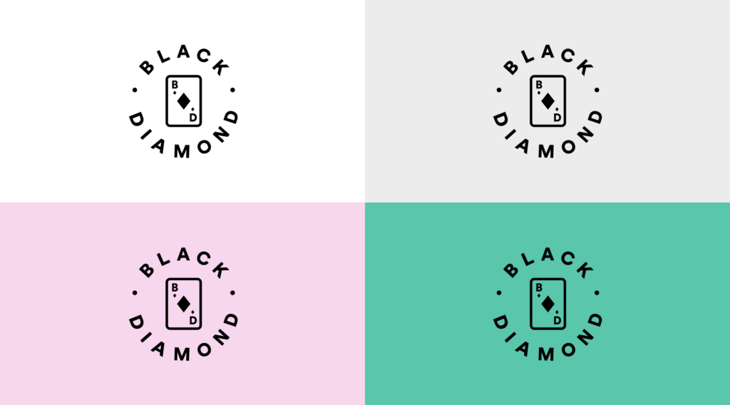
Black Diamond
This was one of our standout brand redesigns that we delivered in 2020.
Black Diamond is a staffing agency who engaged us to fully refresh their brand. Initially, their brand name held no significance. But after a thorough refresh and content guidelines by us, we breathed new meaning and fresh life into their brand.
The concept of playing cards felt right to us as Black Diamond is a jack of all trades and a master of one — brand amplification. Just like a deck of cards to a magician, Black Diamond is the practicality behind creating magic.
Their fresh logo embodies these connotations and is a modern upgrade from what they had previously. Plus it looks great on shirts and tote bags!
![]()
Hot Tip: Your content guidelines exist to shape and give meaning to your brand design. They work hand in hand.