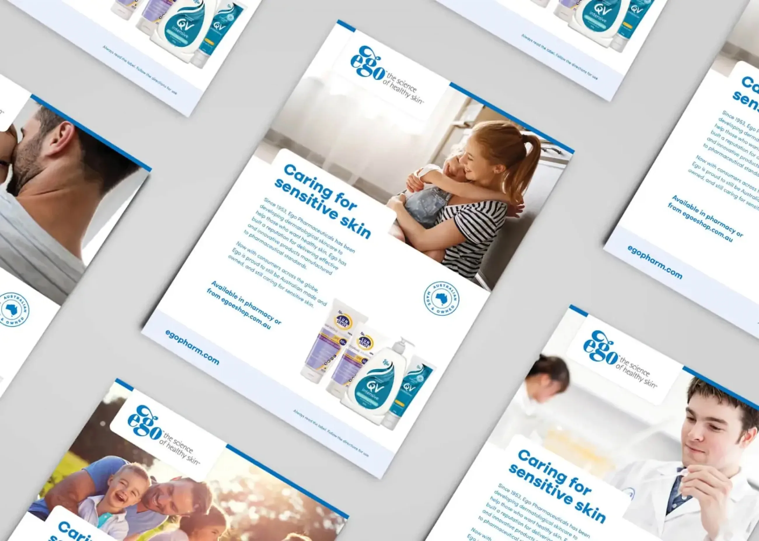
Ego Pharmaceuticals are an iconic skincare brand with a long-standing presence in the industry. Their products are trusted in households across Australia, but the brand itself had grown up in pieces. Despite their reputation, the team felt their branding and online presence needed a revamp, along with clear guidelines for future use across a wide range of applications.
This was not a reinvention. It was a considered exercise in bringing an established, much-loved brand into line.
Keeping the icon, refining the system
The overhaul retained the iconic Ego blue that customers know and trust, then built a refined system around it. We introduced a set of secondary brand colours to complement the hero blue, giving the brand flexibility across its many products and channels without diluting what makes it recognisable.
Guidelines with real depth
We worked with the Ego team to create extensive and detailed brand guidelines that go well beyond a logo sheet. The guidelines cover the refined colour palette, typography and application rules, plus dedicated social media guidelines – so the brand behaves consistently whether it is appearing on a shelf, in a feed or in a boardroom.
Templates that make consistency easy
A brand system only works if the people using it can apply it quickly. We created templates for a full range of collateral, including flyers, presentations and advertisements, so every team producing Ego material starts from the same foundation. The result is a heritage brand with its house in order – consistent, flexible and ready for whatever comes next.