
01The short answer.
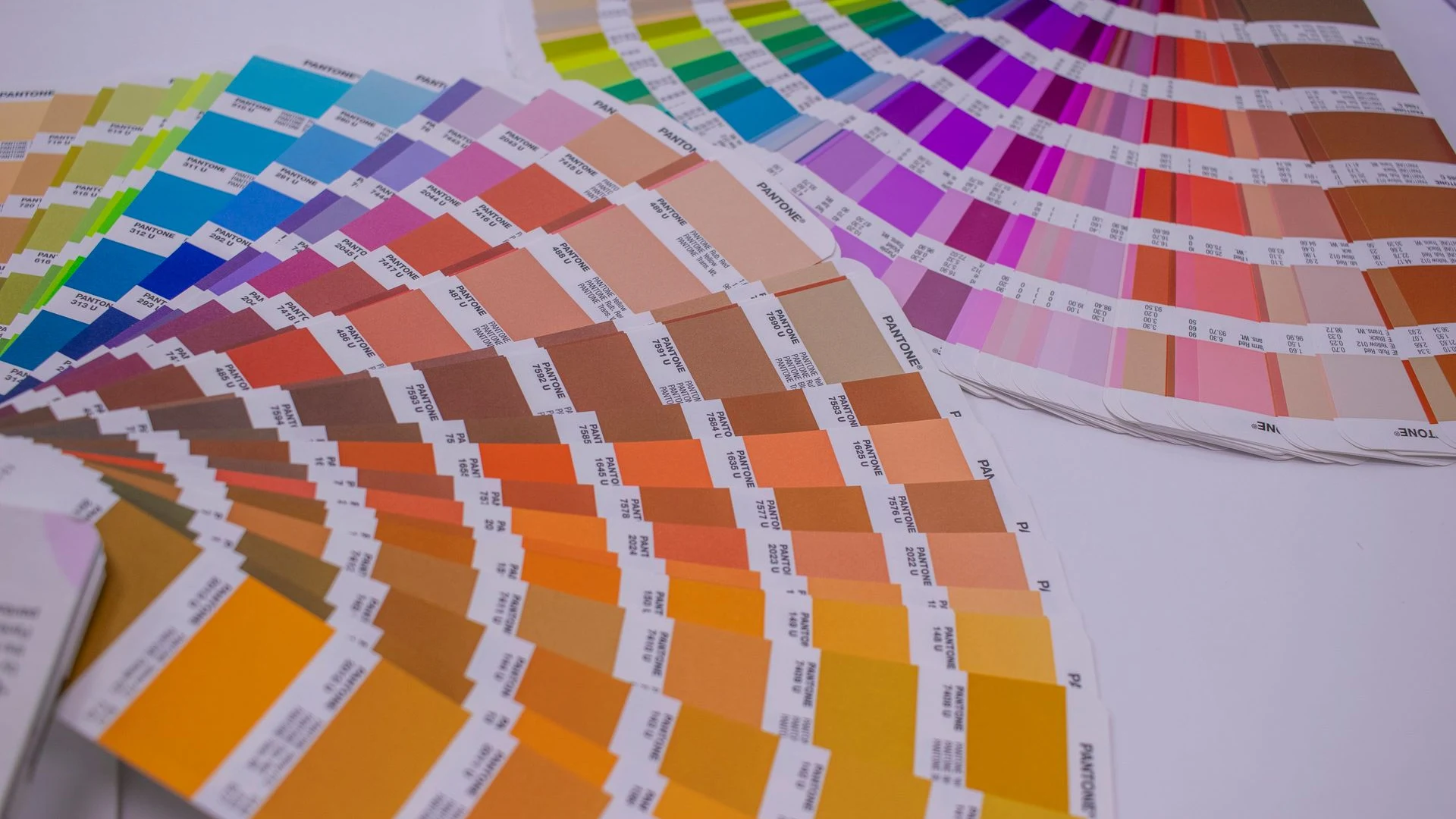
The same orange can look different on a phone, a brochure, a painted wall and a vehicle. Teams often treat that as proof someone got it wrong. Sometimes they did. Often the issue is that light, material and production process were never considered.
Brand colour will not look identical on every surface, and it does not need to. The job is to specify colour clearly, understand where variation is normal and protect the relationship between colours across print, screens and physical materials. brand design gives the system somewhere practical to live.
The useful question is not whether every item looks identical. It is whether people can recognise the same business and understand what to do next, wherever they meet it.
02Colour is a system, not a single code.
Start with a practical colour system that tells teams and suppliers what matters in each medium. The aim is to see the work as customers and colleagues see it, rather than as separate projects owned by separate teams.
Begin with roles, not swatches. Which colour is the recognisable signal? Which carries information? Which supports rather than competes? Once those jobs are clear, give suppliers the references they need for their medium and identify combinations that must stay stable for legibility and recognition.
What to gather
- screen colour values
- print production references
- signage and material samples
- rules for contrast, hierarchy and exceptions
This is why fixing visual drift matters: a system only works when it meets the real work people need to do.
Consistency is a system people can use, not a standard they have to remember.
03Specify the important relationships.
Once the pattern is visible, replace broad instructions with usable decisions. Give every important element a job, name the owner and show the right choice in context. People should not need to decode a design manual before they can act.
Use three simple tests
- Recognition. Does this still look and sound like us at a glance?
- Clarity. Can the audience understand the message without working for it?
- Repeatability. Can another person create the next version without rebuilding it?
These tests stop feedback collapsing into personal preference. They also make it clearer when a new request is a healthy adaptation and when it is a departure from the system.
Build confidence through repetition
An effective system is also honest about the decisions it cannot settle in advance. Managing brand colour across print, digital and signage is not solved by a list of rules alone. The people closest to the work will face new formats, unusual requests and competing priorities. Give them a clear principle to return to, then make it obvious where they can get a quick answer when the principle is not enough. That is how a brand stays coherent without becoming brittle.
Keep the route for questions proportionate to the risk. A routine item should not wait for a senior review, while a major public expression deserves a considered check. This distinction respects people’s time and keeps attention on the decisions an audience will actually notice. It also lets the brand owner see repeated requests and turn them into a better template, clearer example or simpler instruction.
At the same time, resist the urge to solve every exception with more documentation. The most durable systems use a small number of memorable principles, supported by examples that make the intent concrete. When a new team member can explain the reason behind a choice, they are far more likely to make a sensible decision in a situation the guide did not predict.
Finally, test the system in a real working moment. Ask someone who was not involved in creating it to find the right asset, choose a suitable format and prepare a simple piece of communication. Watch where they pause, what they search for and what they decide to change. Those small moments reveal whether the brand has become operational or is still relying on goodwill and guesswork.

04Proof the places customers actually see.
Assuming a hexadecimal value can govern a vinyl sign or that a print reference will behave like a backlit screen. a colour system is a translation guide, not a promise that every surface has the same physics. The better approach is a small operating rhythm: keep current files in one place, review high-visibility work at the right moments and record decisions that will recur.
Use consistency pathway as a companion to the rules. It helps a team keep standards without turning every small decision into a committee meeting.
Make the next action clear
Choose a short list of changes with a visible owner and a useful deadline. Update the master files, remove the obsolete versions, brief suppliers and tell the people doing the work what has changed. The result is a system people can trust rather than another document they are expected to remember.
Measure progress by the quality of the everyday output, not by whether the launch presentation looked polished. When the same business is recognisable in a rushed email, a supplier order, a customer conversation and a new campaign, the system is doing its real job. That level of consistency is built patiently through useful tools, clear choices and a habit of learning from the work once it leaves the studio.
The right default is more powerful than another approval step.
Our work with Golden Hills Brewery shows how a considered system can carry a brand into the places people actually encounter it.

05Make colour easier to get right.
Consistency is not about making a business feel rigid. It is what lets the audience spend less effort figuring out who they are dealing with and more effort deciding whether the offer is right for them.
When the practical system is sound, teams can move quickly and still make work that belongs together. That is the standard we aim for: a brand that survives busy days, new channels and many hands without losing its point of view. Explore our brand consistency pathway when the next step is to bring the real-world experience back into line.

Questions we hear.
Why does our brand colour look different in print?
Print uses inks, paper and finishing processes that absorb and reflect light differently from a screen. Clear production references and physical proofs help you manage the variation rather than being surprised by it.
Do we need separate colour values for every use?
You need the appropriate references for the media you use regularly, plus simple instructions for suppliers. Keep the system useful rather than creating a catalogue nobody can navigate.
Should we approve signage colours before production?
Yes. Large-scale, exterior and material-based applications deserve a physical proof or sample whenever possible. They are too visible to leave to a screen preview.
Can we add new colours for campaigns?
Yes, if the core recognisable palette remains intact and the new colours have a defined role. Campaign colour should add energy without making the parent brand disappear.


