19 December 2019
From Cute to Questionable: Brand Redesigns of 2019
It’s been a huge year for brand redesigns! It seems many businesses want their brand refreshed and ready for the new decade. At Bellman, we’ve taken a look at the major rebrands of the year, and put in our two cents.
Cute: This new Facebook logo was created to make a distinction between the Facebook app, and Facebook as a corporation. This distinction was needed as Facebook continues to buy other apps like Instagram and Whatsapp—a scary thought, but it makes sense. The new logo takes on the colour of the brand it’s joined with, “creating a clearer relationship between the company and the products we build”. And true, it looks cool.
![]()
Questionable: Facebook has been in hot water lately, so the timing of a publicised brand redesign is iffy. The refresh of the logo does not come with new breakthrough process promises, which makes it harder to get behind and excited about.
![]()
Slack
Cute: The app’s new logo is SO much better. Slack admitted their brand design is from before they even launched, so they were aware it needed a redo. Pivoting from the hashtag is a good move as the hashtag has become ubiquitous now across all social media.
Questionable: The colours are a bit random. Why is the lettering in black and not purple? We don’t want to criticise the new logo too harshly, we are big Slack users. But the new logo has been likened to a wet windmill and now we can’t unsee that.
![]()
Warner Brothers
Cute: Yes, the old logo holds so many sweet memories and ignites big nostalgia. But let’s face it, it wasn’t a great brand design. Design agency Pentagram made a clever choice to utilise the shield shape as a frame for any of Warner Bros’ subsidiary brands. It works!
![]()
Questionable: Does it have major DC Universe vibes? With the whole stretching out the logo and making it pointy and spooky? They also show they followed the Golden Ratio for this design—a rule that has “perfect” proportions—which always seems like some advertising fluff, but who knows.
![]()
Reebok
Cute: What’s not to love? It’s throwback nineties with a slightly modern twist. Looking at it is nostalgic and calming. The space around the lettering declutters your brain. You trust this brand mark. You want it to take you down to the local courts and shoot hoops with you.
Questionable: It could be questioned that Reebok is moving backwards instead of forwards with this supposed “refresh”. But hey, it works.
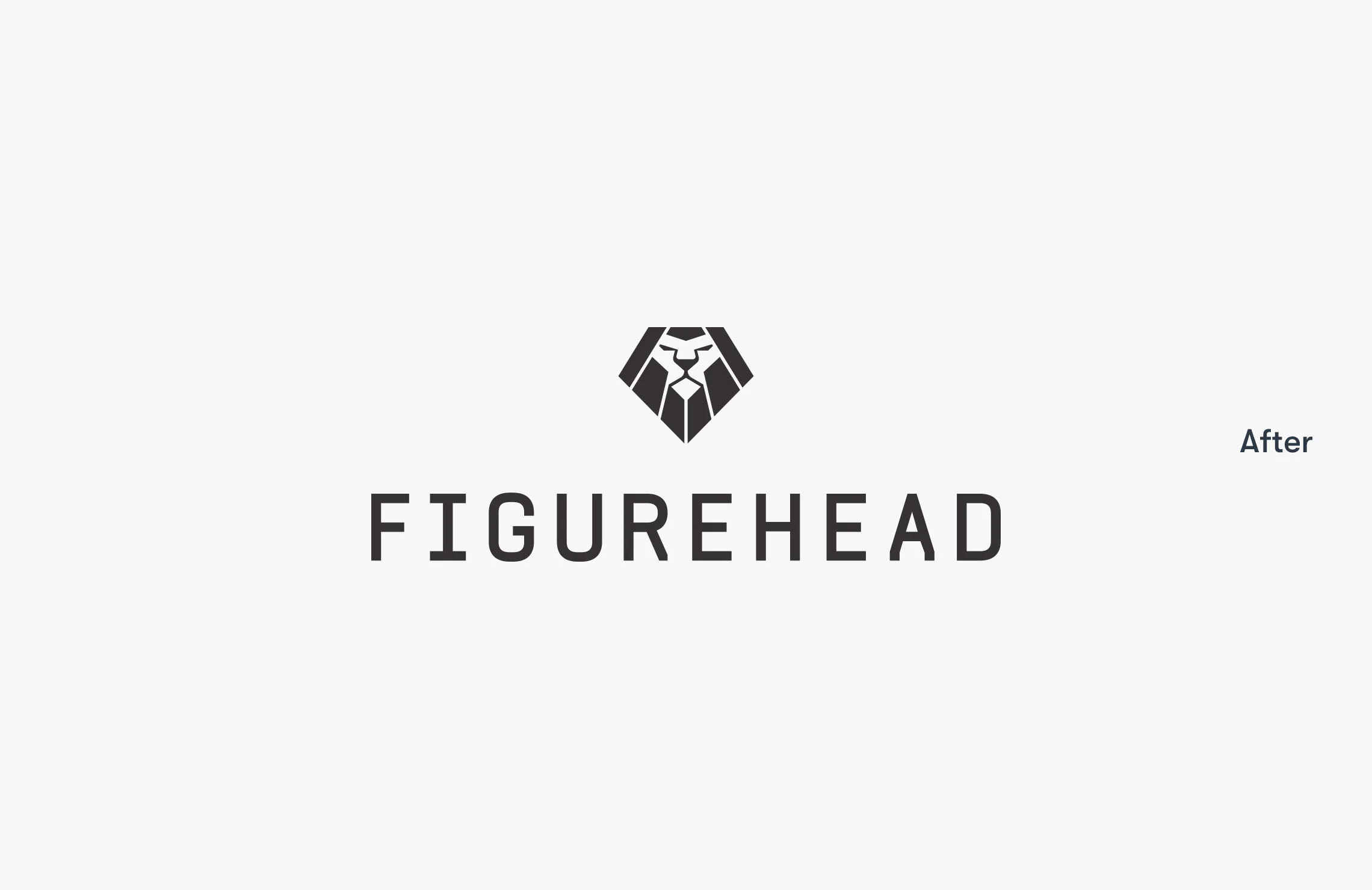
Figurehead
And lastly, our favourite of our very own brand redesigns from this year: Figurehead. As a construction company, they wanted a strong brand design that could be rolled out on signage, uniforms and more. The sans serif font brings the brand into the present day, with elegant spacing and deep charcoal colouring to bring it together as a distinguished, robust brand.
Figurehead’s New Brand Design
We think all of these brands are onto something with their decision to refresh their brand as we launch into 2020. It’s not only a new year, but a new decade. For many brands, it’s time they asked themselves if they’re best representing who they are and what they value in their brand redesigns.