12 August 2021
DRIVENxDESIGN Award: The Details
We have an exciting announcement to make…
We won silver! In the Brand Identity category at the prestigious DRIVENxDESIGN Awards.
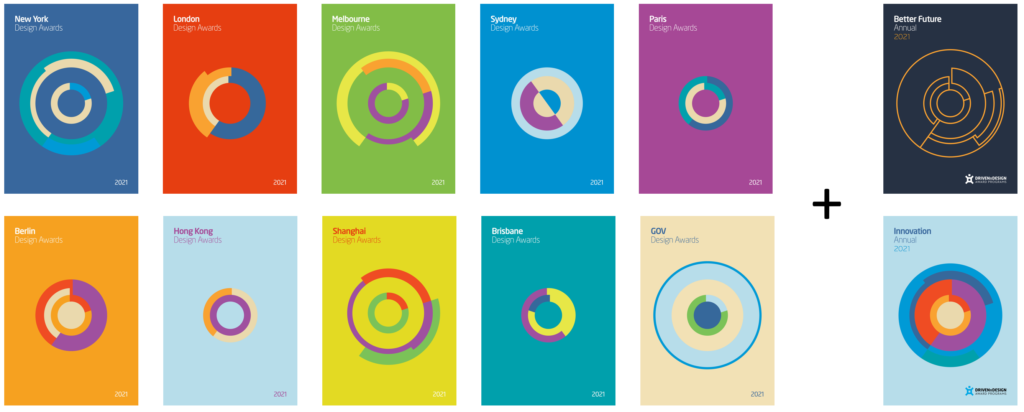
The Awards
DRIVENxDESIGN is the world’s largest network of Design Award Programs.
They like to think of themselves as champions for a better future and bring recognition to design that accelerates transformation, focuses on customers needs and achieves strategic goals.
The Client
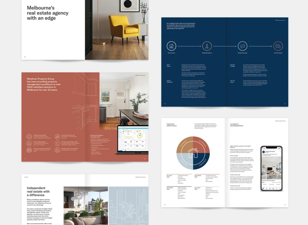
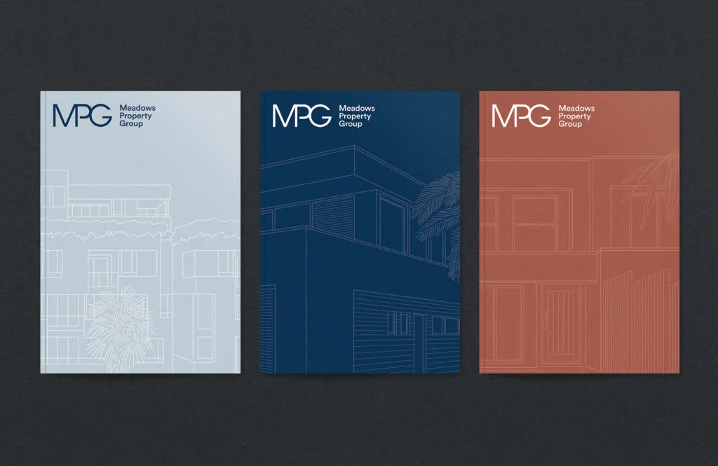
For the Brand Identity category, we chose to submit the work we’ve done for Meadows Property Group (MPG) which you can take a look at here.
MPG is a boutique real estate agency who needed a refresh. Not only this, they needed their new branding to be consistent at every touchpoint to elevate the whole brand and differentiate their brand identity in the saturated property market.
Whether you’re absorbing a brochure or scrolling their website, you’ll understand MPG is a fresh and elegant brand with sharp minds behind it.
The Brief
We’re going to give you a glimpse behind the scenes at what our submission looked like for this award.
This will give you a greater understanding of why our work was chosen to be celebrated and how we conveyed the intricacy of what we’d done. Take a look at this excerpt from the submission of two key questions that we answered.
Project Brief
This is where you need to create excitement about the work; make sure you’ve grabbed the readers’ attention in the first two paragraphs.
In a sector full of hot air, Meadows Property Group are a breath of fresh air.
Each of MPG’s four pillars is grounded in one simple focus: relationships. Success doesn’t come from who they are, but who they collaborate with. For MPG it’s all about attracting the right people, so their identity and branding had to work as a magnet for their audience.
Combining personality with professionalism, the project brief was to undergo a brand refresh and roll out their new identity and branding across collateral and digital assets.
They’re a real estate agency with an edge who needed sharp thinking and sleek branding.
Project Innovation/Need
What is it that you’ve done that’s novel or brings new outcomes to the market?
It is near impossible for a real estate agency to do something different. They basically all do the same thing — sell and manage properties. So how do you stand out in a market so crowded?
Bellman was the answer to that question.
We delivered a suite of collateral that looks separate yet part of a whole. By dissecting their offering into four pillars and effectively communicating this through copy and design, we conveyed their services in a clear and sophisticated fashion for their clientele.
We incorporated line work over imagery in the design — an original concept in the property market that worked to add a unique and personable flair. MPG’s ethos is to put enthusiasm and personalised service into every one of their interactions. So it was important for us that every asset and page we designed took the same amount of care so that anyone seeing it would understand their difference.
By supplying a full suite of services, we ensured that MPG’s brand aligns seamlessly at every touchpoint. We innovated how we communicated their identity and branding in order to achieve a cohesive, elevated brand presence both digitally and in-person.
In a field of monotonous grass, we helped Meadows Property Group be the only flower.