4 November 2021
Colour Personalities + How To Choose Yours
Do you have a favourite colour?
Seems like a childish question, but it’s true that the colour you choose to represent yourself (or your brand!) actually says a lot about you.
There have been many scientific studies researching the psychology of colour theory, and we’re going to help break it down for you.
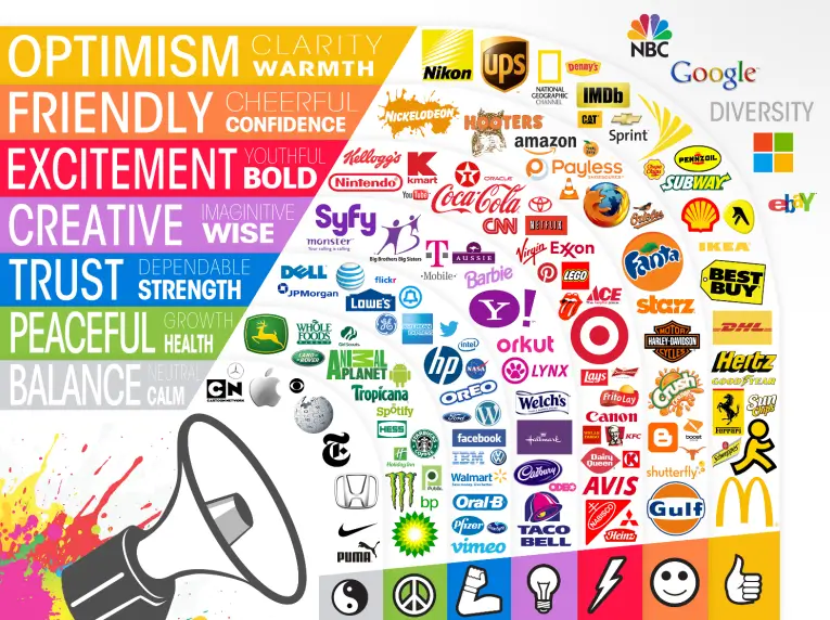
What the Colours Mean
Let’s take a look into what each of the colours signify. This is a good way to understand how consumers might feel about certain colours in your branding.
Red is associated with danger, excitement and youth. It’s also known for being the colour of love and passion — think red love hearts and roses.
Pink is feminine, sentimental and romantic. Baby pink (aka millennial pink) has been popular for creating a sense of harmony and cool girl vibes. But different shades, like hot pink, can be more bold and youthful.
Orange is, just like the fruit, fresh and zesty. It’s a creative, happy, adventurous colour and notably also associated with being cost effective. Remember Orange mobile, the discount phone plan brand?
Yellow is optimistic. Happiness, sunshine and flowers are all associated with yellow. It’s bright and warm.
Green is natural, often used to demonstrate sustainability or health — think vegetables and trees. However green also holds connotations of money and wealth.
Blue is trustworthy and reliable, many corporate brands choose blue for its dependability. Blue is a calming colour, though can also be associated with sadness
Purple is traditionally royalty, however its more modern associations are of spirituality and even kookiness. Purple can be majestic or mysterious and usually quite imaginative.
Brown is down-to-earth and honest, often used for organic wholesome products or to evoke a sense of calm and welcoming.
![]()
How to Choose Your Colours
- Choose your base. Read through the personality traits for each colour and ask yourself, which is most important for your brand? How do you want consumers to feel when they look at your brand design? It’s important that your base colour reflects your most dominant trait as well as relating to your target audience.
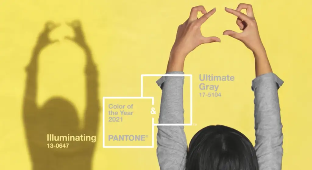
- Choose your accent colour. This needs to work well with your base colour as well as still embodying your brand’s personality. A good example of this is Pantone’s colour of the year for 2021 which is Ultimate Gray with an accent of the colour Illuminating; “A marriage of color conveying a message of strength and hopefulness that is both enduring and uplifting.” They chose to only have an accent of yellow because although it’s a positive colour, too much yellow can actually cause anxiety. This is why finding harmony between your base and accent is so important.

- Choose your neutral colour. This is most likely a background colour and should avoid drawing the eye. Typically this might be an off-white colour that suits the rest of your palette, or perhaps a grey, beige, or even black.
Types of Colour Palettes
When choosing your colour personality, beyond the meaning behind the colours there is also the type of colour palette to consider.
You can absolutely leave this for a designer to create for you, but it’s good to be aware of how colours can interplay.
Monochromatic
When you have one personality trait (or one main colour) that you want your brand to focus on, a monochrome scheme will help emphasise the meaning behind that one trait. This works well for minimalist brands or brands that have a trademarked one colour (such as Cadbury). The challenge here is making sure the hues are still different enough that it doesn’t stunt legibility.
Here you can see the brand mark we created for Steel Window Design in monochromatic black and white. This works well to relate to their product — black steel — as well as reinforcing their premium personality.

Analogous
An analogous scheme means the colours are next to each other on the colour wheel. They create a sense of cohesion as they relate harmoniously to each other with similar emotional connotations. Analogous schemes are safe bets, the only challenge is making sure they make enough of an impact.
Here you can see the brand mark we created for Bounty of the Sun, where we used similar shades of peach. The layers of meaning behind the name and detailed brandmark ensure this logo still makes an impact.
![]()
Complementary
A complementary colour scheme means the colours are drawn from directly across each other on the colour wheel. Because they’re opposites, they bring out the best in each other when paired together. Complementary colours are great for creating vibrant, dynamic brand designs, which is why there are so many well known brands that use this type of colour palette.
We used complementary shades of pink and green for our client Stomp to create a soft yet bold logo that is modern and fresh.
![]()
Triadic
The rule of three. Triadic colours draw in equal parts from three different sections of the colour wheel. This means they’re stable like analogous themes, but with more variety and stimulation. The challenge with a triadic colour palette is getting the three colours to coincide with three traits of your brand identity.
For our joinery specialist client Melwood, we used a navy blue to showcase dependability, a clean white because they are methodical, and a pop of cheerful orange to demonstrate they’re also personable and this is what sets them apart from their competitors.

If you still don’t have any idea of where to begin when it comes to your brand colours, that’s okay! When you engage us for brand design, we take you on a thorough (and fun) onboarding process to uncover the personality of your brand, and therefore your colours.
Ready to find out your colour personality? Talk to our brand design experts today. Contact our brand packaging specialists to enhance your brand’s visual identity.